How to visualize the development of your projects with Gource
Learn how to visualize the development of a software project using Gource and your favorite version control system.
Gource is an open-source tool that lets you visualize the development of software projects from a version control system such as Git, Mercurial, Bazaar and SVN.
For example, here is a visualization, almost 2 hours long, of the entire development history of the Linux kernel from 1991 to 2015:
This kind of visualization has plenty of uses. For an open-source project, it can be a way to recognize the work of an engaged community. It can also serve as an exploration tool.
At the end of 2019, I used the tool to make a video for the retrospective of the Hércules project at Ambev Tech. It was an amazing year, full of challenges, and making this video helped our team end it on a high note. I included the video at the end of the post as a real-world use case.
Easy to install
To install it, you can download Gource straight from gource.io, or install it with your favorite package manager.
How to install on Mac:
brew install gourceHow to install on Ubuntu:
apt-get install gourceHow to install on Windows:
choco install gourceEasy to use
To run it, just navigate in the terminal to the root directory of the repository you want to visualize and run the gource command. The tool opens in interactive mode, and you can zoom, pan and explore the elements of the visualization with your mouse and keyboard.
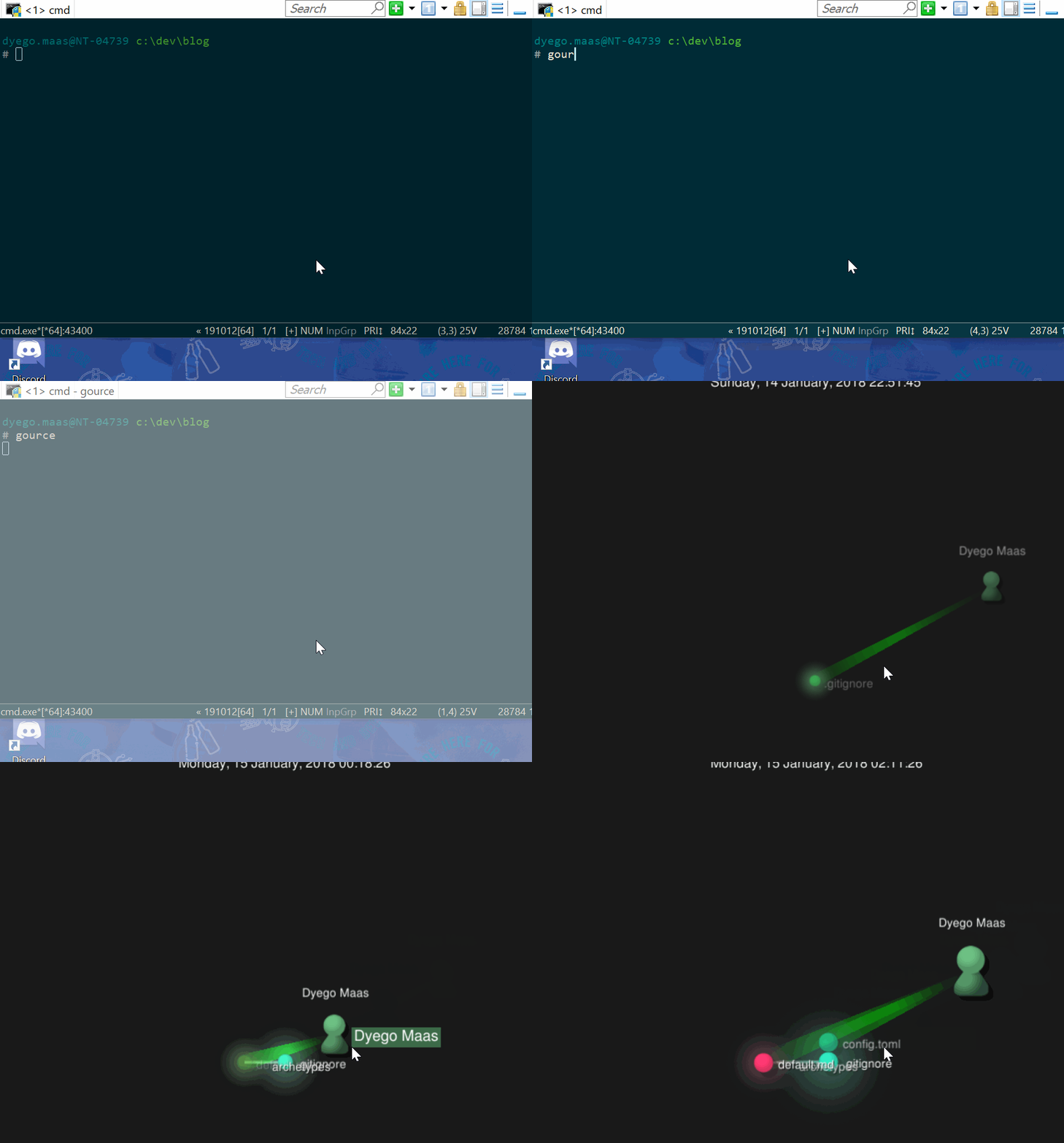
At some point, the result should look something like this:
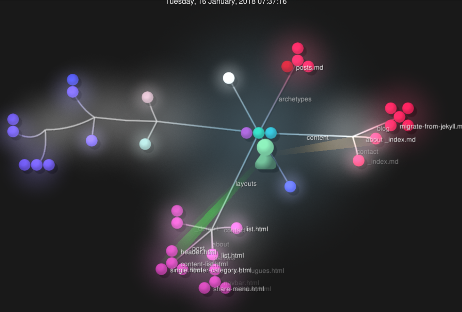
The tool draws the directories as a graph; each file is a little ball:

Lots of options
You can customize many aspects of the animation and get wildly different results. Below I list a few options I find really useful.
To use them, just run gource followed by the parameter you want.
Configuring the viewport
- Window size:
-1280x720(width x height) - Windowed mode:
-wor--windowed - Fullscreen mode:
-for--fullscreen - Borderless window:
--frameless
Clipping a slice of the visualization
You may not want to visualize the repository’s entire history. For instance, I started this blog twice; the first year is practically a ghost town, and the second year is much more interesting to watch. You can pick the exact point in the timeline where the visualization should start and stop:
- Start:
--start-date "YYYY-MM-DD hh:mm:ss +tz" - Stop:
--stop-date "YYYY-MM-DD hh:mm:ss +tz"
Both parameters accept dates in the following formats:
"2012-06-30"
"2012-06-30 12:00"
"2012-06-30 12:00:00 +12"
Alternatively, we can pick the start and stop based on a position on a scale from 0.0 to 1.0 (or even “random”):
- Start:
-p POSITIONor--start-position POSITION - Stop:
--stop-position POSITION
You can also stop the animation after a number of seconds: -stop-at-time SECONDS.
To skip periods of inactivity, we can use the auto-skip parameter, which skips entries in the repository log if nothing new happens for that many seconds of animation:
a SECONDSor--auto-skip-seconds SECONDS
Running in a loop
We can run the visualization in a loop with the --loop parameter, or wait a few seconds before starting over: --loop-delay-seconds SECONDS.
Controlling the visualization speed
There are two ways to control the speed of the simulation. The first is to specify how many seconds of animation each day of work should last, with the -s SECONDS or --seconds-per-day SECONDS parameter.
For example:
- 1 day / second:
--seconds-per-day 1 - 5 days / second:
--seconds-per-day 0.2 - 10 days / second:
--seconds-per-day 0.1
The other way is to control the time scale with the -c SCALE --time-scale SCALE parameter. The scale ranges from 0.0 to 4.0 and can be used both to speed up and to slow down the animation:
- 2 times faster:
--time-scale 2 - 10 times slower (slow-motion):
--time-scale 0.1
Controlling how the visualization looks
We can pick the background:
- Background color:
-b FFFFFFor--background-colour FFFFFF(hex color) - Background image
--background-image IMAGE
We can set the project’s logo:
- Logo image:
--logo IMAGE - Logo position:
--logo-offset XxY
To tweak how much the elements glow, you can play with these two parameters:
- Amount of bloom (glow):
--bloom-multiplier FLOAT - Bloom (glow) intensity:
--bloom-intensity FLOAT
You can improve edge quality by turning on anti-aliasing: --multi-sampling.
And if the visualization is running too slowly, you can try turning off vertical sync with the --no-vsync parameter. I don’t recommend it if you plan to record a video, since some artifacts will end up showing (partially rendered frames).
Beyond these options, there’s a ton of settings for text, file names, users, visual effects and much more. You can find all of them in the project’s README.
Full guide
A full guide to the parameters Gource supports is in the project’s README on GitHub.
Generating a video of the visualization
Gource can export the visualization in PPM format:
- File name:
-o FILEor--output-ppm-stream FILE - Set the framerate:
-r FPSor--output-framerate FPS(in frames/s)
The resulting video stream file then needs to be converted into a more common format such as MKV, MPEG, WEBM or MP4. For that, we need help from another tool.
One tool that proved useful was avconv. With it, we can get the job done with a command like this one:
avconv -y -r 30 -f image2pipe -vcodec ppm -i video.ppm -b 32768k video.mp4The retrospective video - a hands-on example
To wrap up, I’d like to share the video I mentioned at the beginning of the article, which I made for the Hércules team’s retrospective at Ambev Tech at the end of 2019:
To make this video, I used Gource to generate the PPM and avconv to convert it into video.
To make things more interesting, since it was for a year-end retrospective, I decided to add a soundtrack and a few extra labels to the video, plus, of course, Baby Yoda at the end. For that, I used VSDC Video Editor, an excellent free video editor. I bought the soundtrack for five reais (about a dollar), making sure to pick one with the right license.

How it was made
I ran Gource with the settings below. I tried many other combinations before landing on this one:
gource \
-s .1 \
--start-position 0.5 --stop-position 0.6 \
-1280x720 \
--auto-skip-seconds .1 \
--multi-sampling \
--camera-mode overview \
--bloom-multiplier 1.2 --bloom-intensity 0.5 \
--stop-at-end \
--highlight-users \
--hide mouse,progress \
--file-idle-time 13 \
--max-files 0 \
--background-colour 000000 \
--title "A Jornada do Hercules (Ago 2018 - Dez 2019)" \
--date-format "%d/%m/%y" \
--font-size 26 \
--logo c:/temp/logo_hercules2.png \
--output-ppm-stream - \
--output-framerate 30
-o hercules.ppm
To convert the PPM file into video, the first tool I tried was ffmpeg, which I was already somewhat familiar with from extracting audio from videos and other basic tasks like that. Unfortunately it didn’t work as expected, but avconv got the job done.
If you’re curious about the ffmpeg attempt, I put the script up in this gist. The problem was that the process always hung shortly before finishing.
So, to convert the PPM into an MP4 video, at a 32Kbps bitrate and 30 FPS, I ran avconv from a Docker image. It fit like a glove:
docker run --rm -v $(pwd):/workspace jrottenberg/ffmpeg:4.1-alpine \
-y -r 30 -f image2pipe -vcodec ppm -i /workspace/hercules.ppm \
-b 32768k /workspace/hercules.mp4
Conclusion
Gource is a fantastic tool for visualizing how software projects evolve. It’s easy to install, easy to use and offers plenty of customization options.
Whether you’re putting together a project retrospective, making a promo video or simply exploring a repository’s development history, Gource is an excellent choice.
Being able to generate high-quality videos makes the tool even more versatile, letting you create impressive presentations and visuals that show the progress and evolution of software projects.